Smartz Website Redesign
Analysing the current state and redesign process of Company's Website
WEBSITE REDESIGN · UI DESIGN · UX RESEARCH

INTRODUCTION
In this live project case study, we explore the current state of the company's website and the detailed process of redesign. Centered on user experience (UX), we highlight challenges, strategies, and outcomes that elevated the website's functionality and appeal.
MY ROLE
User Research, Site-Map Wireframing, UX/UI Design
THE TEAM
3 designers, 1 product managers and 4+engineers
TIMELINE
July 2023 - August 2023

WHAT DOES SMARTZ DO?
In this live project case study, we explore the current state of the company's website and the detailed process of redesign. Centered on user experience (UX), we highlight challenges, strategies, and outcomes that elevated the website's functionality and appeal.
BRIEF
Smartz currently operates a live website comprising around 15 pages, The navigation bar allows the user to choose and redirect to a desired page. The decision to undergo a redesign stems from the aim to bring the website in line with Smartz's status as an established business.

The project needed extensive research to understand the different kind of users, competitive audits and to understand what users want to see on a company’s website.
Conducted an extensive research to assess the current state of the website. This process allowed me to question the need for certain sections/data presented on the website. It was important to retain certain data and omit the rest, which was finalized and discussed with senior executives, who interacted with various site users in the real world.
Conducting user research to understand preferences and needs, followed by ideation to make the designs more intuitive

This phase established a robust foundation for my design strategy, informed by data-driven decisions. Conducting secondary research, I collaborated with senior executives, undertook competitive audits (omitted for privacy), and focused on enhancing information architecture.
Drafted personas, informed by user desires, expert input, and media interviews, revealed key pain points. Research concluded that continuous updates enhance engagement and an online presence with clear communication and testimonials boosts credibility, differentiating the company in the market.
Phase one's analyzed data informed the creation of a user-centric sitemap, enhancing both SEO performance and user experience. Cross-referencing with user personas ensured proper addressing of pain points, leading to an improved and intuitive design structure.
DESIGN
In redesigning the website, I commenced by crafting a comprehensive sitemap, guiding the structure, layout, and user flows of each page. With a clear vision in mind, I proceeded to sketch wireframes for key pages, such as Explore Blogs, Contact Page, Product Pages, and the Home Page.
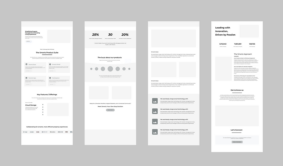
For the Explore Blogs page, I focused on enhancing user engagement by introducing categories for easy navigation and providing estimated read times. Additionally, a "quick reads" section was incorporated to cater to investors seeking concise information.
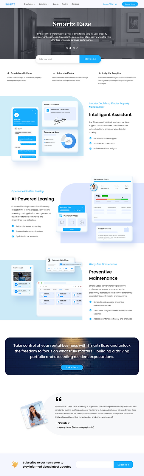
The Home Page received special attention to create a captivating first impression, incorporating strategic elements to communicate the company's value proposition, showcase recent updates, and facilitate easy exploration of the website's offerings.
Recognizing the significance of the Contact Page, I revamped it to prioritize accessibility and clarity. This involved restructuring the contact form based on user research insights, implementing Hick's Law to streamline user decisions, and enhancing the visibility of office details for improved user satisfaction.
Each Product Page underwent meticulous design considerations to highlight key features and benefits, ensuring intuitive navigation and clear calls-to-action to drive conversions.


Implementation of Hypotheses
1. IMPLEMENTATION
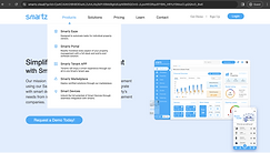
We integrated the signup and login buttons in the navigation bar, and redesigned the dropdown menu to showcase the product feature and solutions in a distinct manner.
BEFORE REDESIGN
AFTER REDESIGN

2. IMPLEMENTATION
we made text adjustments to emphasize the aforementioned point, while also streamlining the cluttered product feature section with concise overview images and highlighting key points.
BEFORE REDESIGN

AFTER REDESIGN

3. IMPLEMENTATION
We integrated the signup and login buttons in the navigation bar, and redesigned the dropdown menu to showcase the product feature and solutions in a distinct manner.
BEFORE REDESIGN
AFTER REDESIGN


Working with a dynamic team was a privilege; applying real-time learning was invaluable. Key takeaways: collaboration and ongoing learning.
Research is paramount in design, it shapes your strategy.
Iteration enhances design more than expected
Strive to eliminate bias and prioritize the end user.
Collaboration and feedback offer invaluable learning opportunities.
Effective presentation is crucial for garnering support and clarity in design decisions.
🚀 That's a wrap for now! 🌟 Stay tuned for the exciting developments ahead. Can't wait to share the final masterpiece with everyone. Cheers to progress and anticipation!